Change of address: http://ArtistsinProgress.wordpress.com/
The new blog address has a new posts! The change is to be more inclusive of artist’s in general. At present I am gathering studio images and/or sketches of others which lead to finished works- yes, work in progress, the in between state of the end results. This is an ongoing area to look at the generating and formulation of ideas in to the work you make. Please share an image or two with us here at:
‘The Moment of Privacy Has Passed’.
‘The Moment of Privacy Has Passed’: Sketchbooks by Artists, Architects and Designers’. (11 Dec 2010 – 20 March 2011). Usher Gallery, The Collection, Danes Terrace, Lincoln.


I am very pleased to present an exhibition featuring the SKETCHBOOKS of artists in progress. These items a fore-running motivation propelling the mentality of this blog.
There are over 200 sketchbooks in this show by contemporary artists, before I get the chance to see the show I naturally begin to imagine what these books may contain, what they might look like inside. The world of art is like this for me, I often imagine what I think of as ‘good’ before I see/experience it, and when I do, it is not as I imagined- thankfully. Then I must go with it, get into it, toil with it, reject or accept.


Intrigue is in the surprises: seeing the uber personal artists’ sketchbook turnout to be exact depersonalised plans for work, or to see the bleak conceptual artist turn out pages of emotion with tear and blood stains on the page… well, maybe. Intriguing to my viewing experience is to be able to find the connections from one place to the other within the work, this is where the sketchbook gets my interest, mixed with a little psychology towards understanding this way of thinking, doing and being. Lets not forget: “Art Saves Lives”. Yes, something without obvious practical problem solving attachments, saves lives..


I think it is curious that it hadn’t occurred to me, the numerous sketchbooks I was filling each year may turn to becoming a real personal exposure, not to mention a deepening what I’d say is my finished work [which I do not blog]. These have turned to being an influence-unexpected and my work at present is beginning to show a merging affinity. Redefining what I’d like to call finished work, and how this so called finished work should ultimately look when I have finished working on it. (Great art works -you could argue- never finish if its meaning is progressively being up-dated with each new generation or viewer).


More about the exhibition: HOLD ME! TOUCH ME! FEEL ME!
Visitors to the Usher Gallery in Lincoln will be able to select, take off the shelf and browse through over 200 sketchbooks on loan from contemporary artists, architects, designers and makers. The exhibition focuses on the ways in which we can engage with ‘the sketchbook’ in a gallery context. The sketchbooks have been contributed by artists from all over the UK, the USA and Europe. Curated by John Plowman and will be accompanied by a two-day international conference entitled Recto, Verso at The Collection on 10 & 11 February 2011.
Divided into four zones the exhibtion incorportates the conventional modes of display of the Cabinet and Wall, the cutting edge of the Digital and the innovative Library. These private and self-referential sketchbooks visible within a gallery context will offer up new insights and perspectives on this hitherto invisible aspect of the creative process.
The Cabinet, Wall and Digital zones will feature sketchbooks from contemporary artists including Grayson Perry and Simon Faithfull as well as historic sketchbooks from the Usher Gallery’s collections.
Gravid Uterus Twin is in.
[Many thanks to those who got the chance to vote, my drawing has now been entered into the Birth Rites Collection! All the works in the growing collection relate to the potent topic dealt with by contemporary artists. http://birthritescollection.org.uk/#/gravid-uterus-twin/4543950025 to see all the works by fellow artists in various media].

The Gravid Uterus, as William Hunter might explain: is the state of the uterus in pregnancy, in this case nearing birth.
The drawing (below) is derived from historical and current anatomical imagery (namely, an illustration for William Hunter 1890), originally I intended eventually to paint into. Yet, my processes to deal with this sort of layering of drawing within painting suddenly seemed less interesting. In fact, the drawing took on a different tone because it had began it in a different mentality altogether. Subject wise, during the making of the image a lot thoughts crossed my mind about embryonic division, cell divisions to twin divisions. The drawing plays with the idea of the foetal developing ‘recipe’, whereas the ingredients is only one part of the individuals becoming, the other is how it is ‘cooked’ – so to speak. Meaning what actions are taking hold during its rapid development, what stages are happening when. Other elements of the drawing indicate the foetal stage which highlights in gestation our non-difference, not only to the mammal kingdom, but the animal kingdom.
. Pencil on paper. (140x176cm) Aug 2009")
All of the knowledge above is learned from various sources, at various times, in various passings, in a non-academic environment. It seems to me at least, that there is a very current theme today where a mass of knowledge information is being learned by the masses via very accessible documentaries and popular science literature. The rigour of scientific correctness at times seems to become a play of rhetoric; taken in parts, summaries and conclusions with varying degrees of human error (both presenter and watcher) and personal interpretation/explanation—
–to bring you images like this one no doubt.
Painting the lily’s into the flesh sketch.
This oil sketch on transparency is a small area traced from my painting being produced throughout this November. This sketch was to try out a straight forward order-of-colour, for this particular technique. Learning that any white used in the paint bleaches out my marker pen under drawing, where as diluting a colour more lightens the colours as the pure colour and darker colour washes strengthen the line drawing.
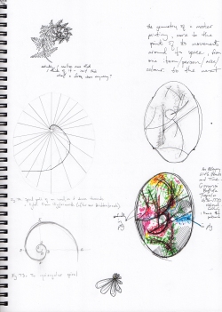
Internal human anatomical details are merged beautifully with the painting. The overall composition is based on a couple of the thumbnail sketches posted in the ‘Studio’s and Sketchbooks’ category. The painting was drawn extensively this way, each element from its own particular source.. botanical photography, anatomical illustration and personal drawings.. The movement through the painting has been predetermined with the geometrical curves and branching ruled lines as suggested in the thumbnail sketch. *An animation from beginning to end of this painting is in the making.
 Detail (6cm) from ‘Sketchbook6 page1’. 2010.
Joseph Beuys’ blackboards, thinking for expulsion.

Do they still use blackboards in schools? Possibly, they won’t be around forever.
Regardless of the ‘ground’, these temporary images are a epicentre for densely packed information and imprecise fast moving illustrations. To me they externally visualise a thinking out-loud, create multiple arrangements on the 2d surface that can be an aid spanning age gaps, knowledge gaps and many ‘communication’ gaps. For some reason, this speeded up pace of creation can pull the work out of the clichés over analysis can achieve. Especially, if you are the type to finalise an art work (in your minds-eye, for example) before the visual try outs. The vast array of imagery we have on the internet (in blogs) creates an image repetition in society which can be riddled with ideas which start to very simply assume it is an ‘artistic’ image.
As Siri Hustvedt writes in The Mysteries of the Rectangle, the cliché: is not that its necessarily a bad idea, the cliché is a good idea poorly done..*
*This exists as a misquoted for now as the book has no index! (do I attack the publishers?), after two scans and rereads of the book, it will have to wait til post-blog publication; I know the world will hold its breath for the correction].
. moma")
Joseph Beuys (1921-1986), extremely influential artist, whose artistic endeavours spanned political boundaries and worked with social idealist tendencies, a feeling for that I think remains in these blackboards. These were real teachings, of a different nature, not yet on the curriculum, though I am sure the government have plans (ignoring his teaching position dismissal for wanting to except ANY student into the arts courses). Beuys’ teachings inspired idealistic thoughts that anyone can be an artist and advocated art for all. These statements are perfectly debatable or ambiguous in their meaning: pointing out that through the idealistic statement he highlighted the actual difficulty and real rigour it takes to be called an ‘artist’.

Seems it is lovable and just to call a child an artist, but something wholly different for the adult world. Looking again at the blackboards and sketchbook images posted (and to be posted) we sense the thirst for knowledge, the need for real communication with the audience and the expulsion of human energy not yet in any precise form neatly articulated or packaged.

Now to find some chalk and blackboard spray fixative.

Short article in an Australian Arts and Entertainment site called the Blurb (’08).
Sketchbooks of graphic artist desire fine art?
Response to a book review of: ‘Sketchbooks, The Hidden Art of Designers, Illustrators and Creatives’.

This article has best intentions. Clearly graphic artists may be influenced by art in its purist sense, while contemporary artist’s (in their purist sense?) may be influenced directly from miscellaneous commercial art. It is interesting that halfway through this article he argues these images are more like “fine art”. Although, maybe in this sense he means skilled art as historically documented, as opposed to the fine art of a young artist in art school studying ‘fine art’ for example. In this sense this would be very far the case, merely because a few of these images are “loose” and has not got a consumer goal clearly defined as graphic art usually does, does not necessarily mean its fine art. Fine art imagery has its own sense of criteria, for example may at times produce what may seem like nonsensical random output proving itself only through a view of its oeuvre or vice versa. Strangely it may be at odds with a singular message, and may not be simply working out the best method to find the image graphically strong, approachable and succinct. Art which is ambiguous or aloof even from its creator, doesn’t cohere with the work of the graphic artist.
It is an interesting point which sometimes crops up in society -from a layman’s point of view- that at times an image which is ‘messy’ is instantly deemed art, and the clean image deemed graphic illustration. This may explain why a large array of the arts have in appearance crossed paths convincingly. An awareness or even intuition into the content and context help to distinguish what is happening (as with any language). This does make the images richer to the intellect, yet muddy an instantaneous reading -unbearable to so many! If this world of art and its distinctions is so deep and murky who would blame the one who speaks too soon? Maybe just ask them to look again, more closely, for longer, without instantly opening their mouth.
The entry of Crow into I am ONE magazine.
Crows in print with the cultural magazine I AM ONE. I have been lucky enough to feature work for the last two (quarterly) editions. Here is the winter issue using the crow images some of which are featured drawings in this blog.

2009: The Year of ONE the fastest growing international project based in Scotland for new and known artists, musicians, writers and people of all types. Scotland – Glasgow, Edinburgh & Nationwide.
International – Amsterdam, London, New York, Paris, Prague/Czech Republic, Stockholm, Valcaea/Romania, Selangor/Malaysia. Edited by Martin Belk.


Hard in the Paint by Raymond Pettibon, ..”mines the American subconscious” (short article)
Link to short article and more images:
Perfect Game: Raymond Pettibon, Hard in the Paint

The further myths or facts of Crow.


Sketchbooks -part2- as a constant state of mistake making, incompleteness and potential.


For some the sketchbook may be the definitive middle, between the conception, into actualisation of work. These are the thinkings become visible, existing as a real working element into the creating of art. An appropriately titled exhibition The Time of Privacy has Passed is soon to be holding a catalogue of sketch books (mine included).
Personally, in the past I was not impressed by the students’ sketchbooks, full of dodgy collage, news paper cut-outs, and a host of materials utilised. Clearly it was stuffed to the brim to ‘show your thinking’ (like you do at a maths exam) that to me seemed contrived to please the teachers. Yet, you can see how this should work as a methodology, for one, sketchbook work serves me as a memory for things I’d like to do, like to repeat, and importantly, where I wanted to go. Exhibiting to my minds eye ideal states of future artistic flourish that will be done.. I just don’t know how it will all evolve, yet. 
The sketchbook work here could be generally regarded as a constant state of mistake making, incompleteness and potential. Possibly, with mine -usually in stark black and white pens- they are simple enough to look like the printed page, yet they are askew, randomised, with ambiguous dodgy thumbnail drawings.

Work Tables and Tischmatten, Dieter Roth and Bjorn Roth (short article)
Stick the Landing: Dieter Roth and Björn Roth, Work Tables & Tischmatten at Hauser & Wirth
By Michael Tomeo. October 18, 2010
 Bürotisch-Matte, Bali-Mosfellssveit, 1994—1996
When I was in art school, there was a painting professor who would shock new grad students by propping their palettes up next to their paintings and explaining, in great detail, why the palette was aesthetically superior. The students were crushed. How could a perfunctory manipulation of materials possibly be more successful than their über-personal paintings? He’d then rebuild their egos until they painted exactly like him, but I think he had it right the first time—materials are everything.
For Dieter Roth (1930 – 1998) everything in life was potential fodder for work. He brought a kitchen sink approach to the German concept of Gesamtkunstwerk that included rotting food, photographs, paint, crayons, film, sound and all sorts of random crapola. Although it could be considered a bit OCD, Roth saved the gray mat boards that covered his worktables and considered them objects d’art in their own right. Called Tischmatten (German for table mats), these works are currently enjoying their own lofty retrospective at Hauser & Wirth.
 Table Hegenheimerstrasse, 1980—2010
In the upstairs gallery, entire desk set-ups have been reinstalled as sculptures. Empty chairs and desks make the artist’s absence palpable. I tried to picture the famously reclusive Roth doodling away at these desks while ignoring calls from curators and galleries but somehow the whole thing felt sanitized. They’re way too boring to be good sculptures and way too clean to serve as some sort of studio period piece. Rather, they feel like lonely archival shrines that just scream “dead artist.”
 Kaffeetisch-mit-Telefonecken-Matte, Bali/Mosvellsveit (with Björn, Karl, Vera Roth and others), 1990—1993
Despite the dialog surrounding Roth’s work, which tends to focus on its abject qualities, a warm sentiment creeps into the Tischmatten that were family collaborations. Reluctant to play along with conventional art world systems, Roth included his family into his working process. Kaffeetisch-mit-Telefonecken-Matte, Bali/Mosvellsveit (with Björn, Karl, Vera Roth and others) reads like a haphazard scrap booking project as a chessboard mixes collage-like with photos and childlike drawings. Given the long history of male artists isolating themselves in their studios, it’s nice to see that Roth was a dad who didn’t care if the kids spilled stuff in his.
Follow my blog with bloglovin
Did I say scientific? I meant to say psychedelic.

Preliminary drawing in a fine permanent marker pen.
This is working towards a new methodology of my paintings. Transparent oils will ‘activate’ the drawing. Diluted into very organic washes and smears where the drawing can still be seen vividly underneath.. two studies have been posted which illustrate this type of painting, as I work further into the alchemy, and further into the decision making process.
Paint so transparent
Methods in progress: The transparency of this painting on acetate can clearly be seen in this projection, which happens to look great- not to mention fleshy, dark, even somewhat morbid, especially in contrast to the actual image (posted in October). The darker areas are actually white, but built up thicker. The beauty for me is in the inkiness.
Sunflower venous system sketch
 Sunflower Root -sketch ‘specimen’.
I like composite images. In order to make larger amalgamated images which feel slightly disjointed, a large range of what could be called ‘specimen’ drawings are made. Later these are worked from, juxtaposed or projected onto canvas, paper, wall and so on..
As most drawing is, it is a method of thinking, a very quick drawing like this may inspire a whole composition. If this sketch is compared to anatomical drawing, it is easy to see the link with this one when in black and white- a tactical shift in colour could rearrange what you see (ie. plant roots or internal venous system).
Plastic anatomy
![]()
This early practice oil sketch on transparency has gone towards a larger work on canvas (right now which is in progress, mingled in amongst more cross sectional anatomy and botanical studies, the image extends outwards to external plant and flowers. This graphic drawing in its middle stage -before it has been painted- will be shown here soon).
Here I feel I am getting to know the alchemy of the materials. In a closer examination the oil shows off its flexibility, in parts completely flat, or the transparent versus the opaque, other areas are starting to look as organic as the flesh itself.

This is an oil painting on a transparent plastic sheet, the oil paint just sits on top and the transparency of the paint and mediums used seem to illuminate the image. On one hand it has its source firmly in Western traditions of botanic and anatomic illustration, while on the other the image in reality seems like a coloured animation still from Disney or a Miyazaki film.. To look further into the image, my interest lies somewhere in the mingling of organic parts- I do this a lot. The scientific studies which have gone on in order to bring us images of clarity have there own interesting aesthetic, and their own interesting history. Mixing the parts helps me question a kind of science fiction which goes on in my mind about the advancement of bodily/organic manipulation.. its potentialities, its beauties, and how we could possibly be ingested into its ostentatious organic overflow and loose ourselves completely. A body completely dispersed, yet in the ether of organic growth, mutation and flow, ‘ourself’ somehow remains in the body(s), spectacular and virtually metaphysical- this is beginning to sound like it has a certain spiritual inclination no doubt. And -importantly- a cross breeding of various current in-depth areas of study which are in contention.
*Note about the flower and anatomical drawing used here, usually I do my own from image banks, but these are derived from two well known illustrators in their respective fields.
Ambiguity in the graphic image.
 This is a curious image which was the result of a series of crow drawings. For me this one was successful, especially in the sense that a very graphic image still remained very ambiguous. Not to mention it is loaded with meaning associated with the ‘crow’ and still remains without a definite good/bad, death/life, … up or down?
‘As the Crow Flies, As the Crow Dies’. Pencil on paper.
Soft… nude

A small selection of pages which echo each other have been scanned in here. The thumbnail sketches lie between an actual desire for representing something, but often clearly edge over into the abstract or geometrical. This comment reminds me (loosely) of a the main fulcrum for artists such as Peter Doig and others. Their work seems to find an inherent abstraction within the image; for example, maybe through an abstract geometry in the composition, and/or when viewed closely the image disintegrates into its mark making and materiality.
I often find myself closely attempting to capture the ease of movement in many sketches later on in larger more realised work. Lately I have been loosely sketching master works of art, for something in it inspires me, and I can learn from. All larger pieces of work seem only come about when I feel I am in it to learn.
Finally, I think what comes forth from these sketch book images is a desire to learn, a thirst for information (depth not breadth I hope!), acknowledging the fact that I don’t really know that much at all.
Last chance to vote for my drawing ‘GRAVID UTERUS TWIN’ BY Oct 16th.
What to do in the studio-as-psychosis?
Without making the condition of being psychotic derogatory, the studio can be a safe place to loose the self, be bazaar, exhibit the changes you are going through.. its incorrigible! I have been a studio prone artist, as I work this way quite well. The flippant use of psychosis touches upon a popular use of these terms, ‘mad’, ‘crazy’ (You should see me out on the town I’m a bit mad lah dee da) basically saying you want to lose control, to do something outlandish and brilliant, and not care.
In this sense to not care is to be uncompromising, now there’s an artist quality of necessity. I always imagine many lose this quality after success directs there work towards the safety of the masses, not to their natural (possibly offensive or artistically alienating but, extraordinary) work. ‘It has been argued that psychosis is simply an extreme state of consciousness that falls beyond the norms experienced by most’. Often we see the work by the few who tap-in to this ideal I am talking about, but few documents really exhibit where the tapping-in happens (without intrupting the process of making or doing).
*[Even here in this mini-article, I have only a few studio and process snaps- others will be dug up soon, and other artists will feature. This is knowingly ignoring the question of if we actually want even more of everything we do documented].
What to do in the studio-as-psychosis?
Painting Exercise -part 4- of the ‘Great Piece of Turf’ by Durer

Now the painting has been finalised (except the options for the background, which are open to various trials due to the fact this has been painted on acetate). In some ways the difficulty of painting this copy, is the control over areas that recede verses the foreground. The differences in materials altered the painting interestingly.
I don’t think I’ll be swapping it for the the original any time soon.

